This is How You Make a Great Poster Presentation
Posters often lack valuable insights, leading to missed important information and hindering efficient knowledge transfer.
If you are enrolled in a Bachelor of Science/Medical degree course, one of the types of assignments you will be required to work on and submit is the poster presentation. This assignment aims to prepare students for what will come during their careers, mainly if they are involved in research studies or improvement projects.
Every year, scientists from around the globe gather at grand academic conferences hosted in hotels. These events are full of enthusiasts in their respective fields. The primary purpose of these conferences is to keep up-to-date with the latest research findings and share their work with peers.
Additionally, they offer a chance to socialise and reconnect with friends from other universities. One of the critical features of these conferences is the poster session, where researchers present findings that may have yet to be covered in more extensive presentations. These sessions serve as a vital platform for knowledge exchange among researchers/professionals.
They often fail to meet expectations.
While poster sessions promise an enriching experience for both presenters and attendees, they often fail to meet these expectations. Presenters may initially anticipate engaging in discussions about their work, only to find that many passersby show little to no interest in their posters, leaving them feeling disheartened. On the other hand, attendees hope to gain valuable insights and new perspectives but are frequently disappointed as they find it challenging to absorb the information as presented.
In every scientist's career, poster sessions can be a hit-or-miss experience, causing mixed feelings about their effectiveness. Whether presenting or attending, the reality rarely aligns with the initial optimism, often leading to a sense of missed opportunities and unfulfilled expectations.
I have often found myself walking into a room with presenters standing by their posters, eagerly waiting for someone to engage with them and validate their research. The posters are often filled with incomprehensible text, making it difficult to interpret the content quickly. I avoid intense eye contact with the presenters while scanning the titles of the posters to find one or two that catch my interest. When I finally find a poster that intrigues me, I read and learn from it. However, the presenter notices the interest and starts to chat, which generally leads to a longer-than-intended conversation.
As a result, I spend more time than planned at one poster, only to realise that time is running out. Forced to skim through the remaining posters, I often leave feeling disappointed, trying to convince myself I made good use of my time. It's a familiar struggle during these sessions, and I frequently wish for more efficient ways to engage with the research presented.
Lack of valuable insights.
I realised that posters often lack valuable insights. Sometimes, you only get to engage with one or two posters, missing out on important information. This not only dampens the experience for both presenters and attendees but also hinders the efficient transfer of knowledge. Such inefficiency slows down scientific progress and holds back our collective potential.
I believe this issue stems from the approach to designing academic posters. Typically, researchers/students only start working on their posters a couple of weeks before the conference, causing them to rush through the design process with little thought or creativity.
Thanks for reading NursesBee! Subscribe for free to receive new posts and support my work.
Instead of having time to think things through and create something original, many use templates borrowed from others in their academic circle. This hurried approach often leads to missed opportunities and a lack of originality. It's a problem that hinders progress in every scientific field, and if it is being assessed, it can also lower one's chances of getting a good mark. Therefore, it must be addressed.
When faced with uncertainty, some people imitate others to feel secure. They might look at a friend's template and copy everything to fill the space, from the introduction paragraph to the correlation coefficients. The result often ends up being a messy wall of barely legible text. However, the feeling of creating something substantial outweighs the concern for readability.
If there's extra time, a voice might suggest making the content more readable by adding a graph, converting text into bullet points, or including a picture. When I first had to engage with a poster presentation assignment, I attempted to spend more time on a poster to improve its usability. Despite adding some elements to enhance it, it still looked like a wall of text in the same old format.
The beautifully designed
Then there are those unicorn posters that only show up once at every conference if you're lucky. They're like infographics, beautifully designed by professionals or former designers turned grad students, utilising templates or professional help. These posters make you feel inadequate because they look great but are still difficult to interpret quickly.
The common problem with all posters, including those I've designed, is that they assume people will stand there in silence for 10 minutes reading them in the order of the sections.
So we design them for THAT kind of user experience, for a context different from how people actually read posters at these sessions. The ACCURATE way to design your poster (based on how they're actually used) would be to project your PowerPoint file on a wall at full size, walk past it over and over again, and improve the design for the experience of learning while walking by. But none of us do that.
Watch: Below are beautiful, infographic-style posters in a short video. They'll move past you at walking speed. Try to read them:
Did you catch anything? Besides the title? Did you even see the title?
To learn anything from the infographic format, You have to walk up and spend a lot of time with it. BECAUSE THAT'S WHAT INFOGRAPHICS ARE DESIGNED FOR. They're designed to sustain your attention while you're right up next to it for 5-10 minutes, reading it silently. Infographics aren't the right goal for scientific posters Because we don't spend that much time with most posters. A BILLBOARD is a better design analogy because THOSE are designed to transmit information as you move past them.
So, what SHOULD an academic poster look like?
An ideal academic poster should accomplish three goals:
First, we want to maximise the insight transferred to attendees in the poster session. If you're attending a poster session, we want to make it easy for you to interact with every poster somehow so that you can conceivably learn the insight that every poster in a session has to offer in less than 50 minutes.
Second, we want to keep the good stuff. We still want time to have good conversations and get deep insight about any poster.
And THIRD, we have to accomplish these goals in a way that is AS LAZY (or lazier) for grad students and scientists to create posters with the new design under time pressure and with no free mental bandwidth. So we have to make it easy so that it's both the RIGHT way to do it and the FAST way to do it.
Let's get started by getting into the right frame of mind. We are going to start things off with one of the most famous quotes in all of design: Perfection is not when you have nothing to add. It's when you have nothing to take away. Good designs are art with something very minimal—like a core thing—and they work from there.
So that's what we are going to do. For that core part, we're going to follow the biggest, most reliable rule in usability research: You put a lot of effort into what people need to know, and then you include the stuff that's nice to know last.
So here's a blank academic poster.
If we could only put ONE thing on it, what is the minimum, need-to-know piece of information that should go on here? That's probably the main finding of the study, right? So we need a finding. I will use factual findings from an actual study I found online.
I want to note down the following text:
We will start by grabbing the main finding — the core takeaway of this study — and putting it on our blank poster.
So, let's examine the main findings of this study.
SEE THIS IS THE PROBLEM I'M TALKING ABOUT. It's taking me way too long to find the main takeaway from this study, which is representative of the problem here.
OK. So, after reading this entire poster, the main finding is this bit right here.
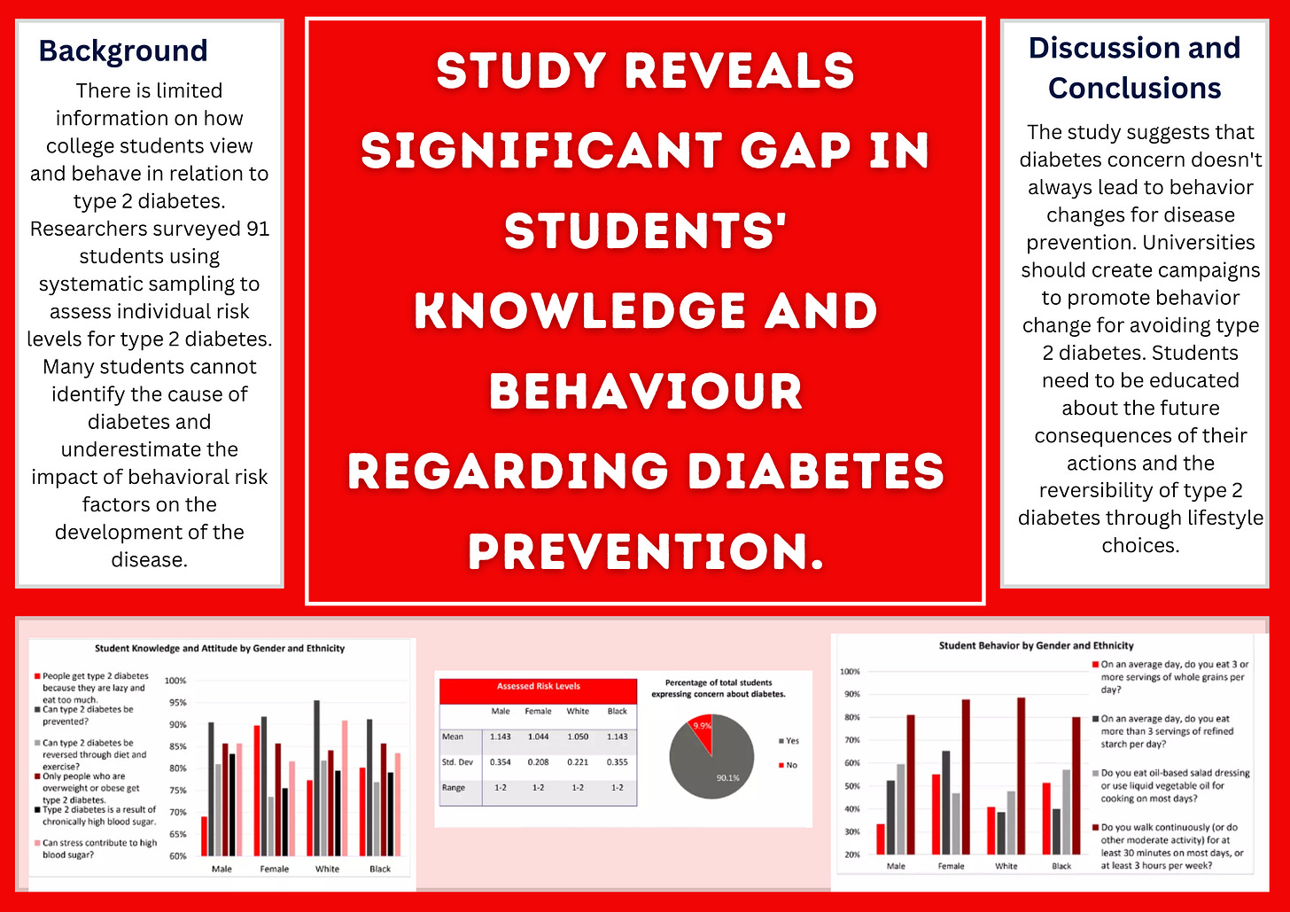
"Findings suggest a considerable gap exists between the knowledge of diabetes and its prevention among this sampling of college students. Results also suggest that diabetes concern does not necessarily lead to behaviour modification needed for disease prevention”.
And then we're going to change the background colour.
Consider using colours that align with the presented content when creating a poster. For example, green could indicate empirical studies, blue for theory, red for methods, and yellow for intervention studies. It's essential to ensure the content is easily understandable, even for those unfamiliar with the subject matter. Research has shown that using plain language is more effective in capturing people's attention. Therefore, our main finding, should be conveyed in a shorter easy-to-understand language:
“Study Reveals Significant Gap in College Students' Knowledge and Behaviour Regarding Diabetes Prevention”
What about those figures and tables that give us that sense of safety and the ability to answer questions?
For that, we are going to add something called an ammo bar.
When creating your academic poster, consider designating an "ammo bar" on one side to access all your figures and tables quickly.
If someone walks up while you're engrossed in a conversation, they can look at the "silent presenter bar" on the other side, where you've organised your academic poster content for quick, silent reading in just a few minutes.
This would be an option of poster:
Other templates:


This new design may seem unbelievable initially, but it's a more efficient way to communicate all the essential information than traditional poster designs.
The new poster design aims to achieve several goals. First, it aims to convey insight efficiently by featuring the main findings in plain and obvious language. This design also makes it easier for graduate students to create posters in less time.
The new design enhances the presenter experience by encouraging more people to look at the poster and providing quick engagement. It also enhances the attendee experience by offering more options for engagement without getting stuck in lengthy conversations.


